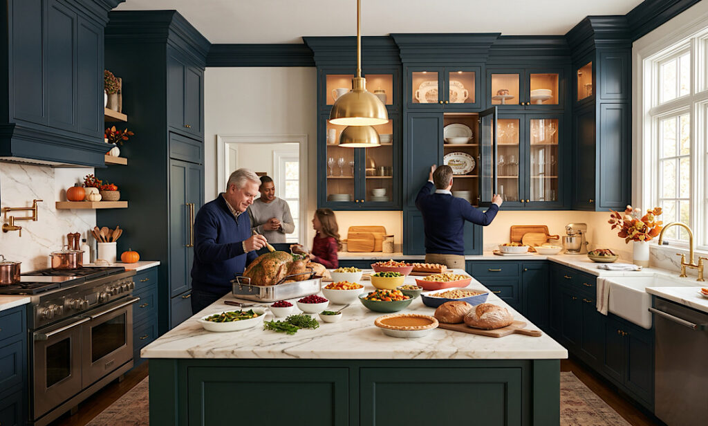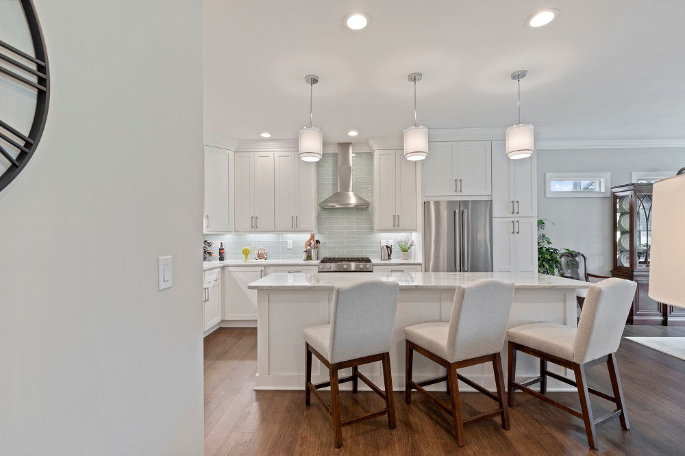
The Thanksgiving Deadline: When You Need to Order Cabinets to Host This Year

Aging-in-Place Kitchen and Bath Design for Murrells Inlet Retirees
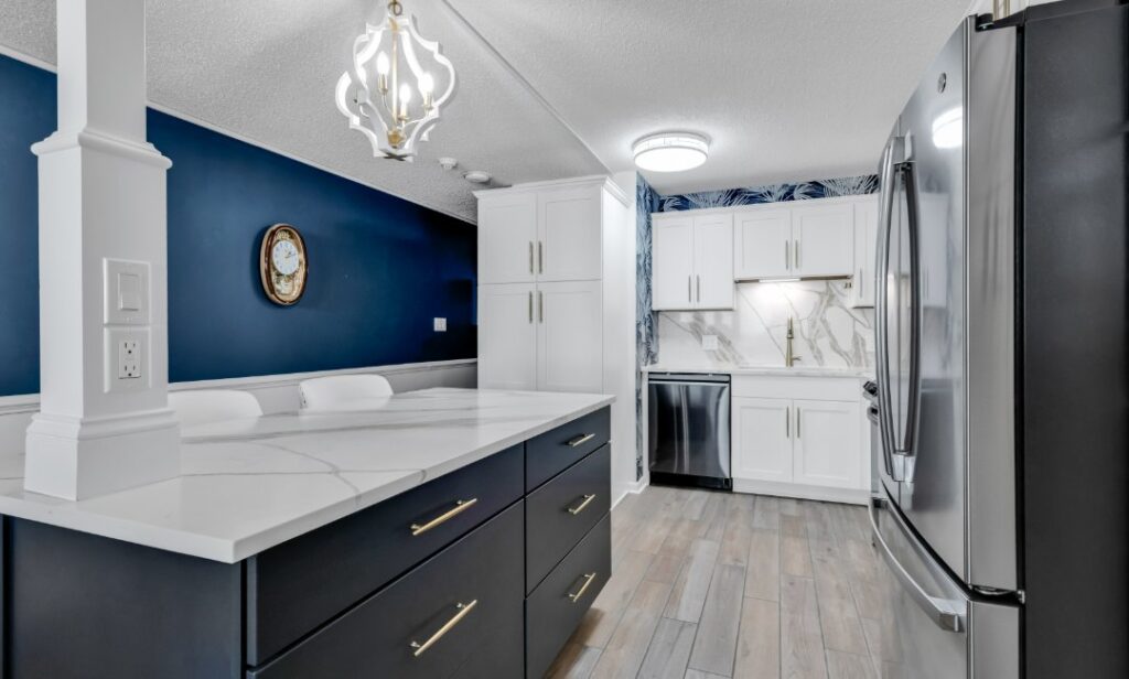
Two-tone kitchen cabinets work when the second color has a job to do. At The Cabinet Market, we design two-tone kitchens for Garden City Beach condos, beach houses, and year-round homes across the Grand Strand, and the ones that look best follow a short list of placement rules. The ones that look unfinished almost always broke one of them.
This guide covers where the darker color should go, how to handle the island, how hardware and countertops connect the two colors, and the mistakes that make a two-tone kitchen look like a supply problem instead of a design decision. If you’re still comparing door styles, our kitchen cabinets in Myrtle Beach page lists the framed and frameless lines we carry.
Why Some Two-Tone Kitchens Look Planned and Others Don’t
A second cabinet color reads as intentional when your eye can explain it. Color that follows the room’s architecture (an island, a run of base cabinets, a tall pantry wall) looks planned. Color that stops at a random cabinet looks like a factory error.
We run every two-tone plan through three checks:
- Placement follows structure. The color changes at a natural break: island versus perimeter, base versus wall cabinets, or a tall cabinet bank versus everything else.
- Contrast is obvious. The two colors should be clearly different in lightness, not separated by a shade or two.
- The accent repeats. The second color appears more than once, or it’s tied back in through hardware, stools, lighting, or the countertop.
Put the Darker Color Low and Keep the Room Bright
The usual rule is dark low, light high, and it holds up for a practical reason. Darker colors carry more visual weight, so they look grounded near the floor and heavy overhead. Light wall cabinets also reflect daylight back into the room, which matters in a condo kitchen with one window, or none.
| Two-Tone Layout | Works Best In | Watch Out For |
|---|---|---|
| Dark base cabinets, light wall cabinets | Galley and L-shaped kitchens, rooms with limited daylight | Very dark paint shows dust and light scuffs near the toe kick |
| Light perimeter, colored island | Open plans where the island faces the living area | The island color has to work with the sofa, rug, and flooring it sits beside |
| Colored tall wall (pantry or oven tower) | Kitchens with a full-height run of cabinets | Needs a clean stopping point at the ceiling and at the end panel |
| Wood-tone island, painted perimeter | Coastal kitchens that need warmth against white | Stain undertones have to agree with the floor |
Treat the Island as Its Own Piece of Furniture
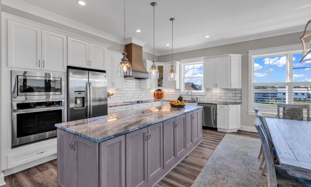
The island is the easiest place to introduce a second color because it’s physically separate from everything else. Several projects from our own specification sheets use exactly this approach with Wellborn cabinetry:
- A North Myrtle Beach new construction kitchen paired Henlow cabinets in Glacier White with a Henlow island in Willow.
- A Sunset Beach, NC kitchen and master bath remodel used Henlow Maple in Glacier on the perimeter and Willow on both the island and the coffee bar.
- A full custom kitchen remodel combined Bishop cabinets in Glacier White with a Richmond Maple island in Onyx with antiquing.
The pattern is consistent: the perimeter stays light and the island carries the contrast. The Sunset Beach kitchen also repeats the island color on the coffee bar, so the accent reads as a decision.
Field Note: If the island is the only place the second color appears, repeat it once somewhere you can see from the island: a coffee bar, a wet bar, a hutch, or a run of open shelves. One repeat is usually enough to make the whole scheme look deliberate.
Connect the Two Colors With Hardware and Countertops
Hardware and countertops are the connectors. Choose them for only one cabinet color and the other starts to look borrowed.
For hardware, a single finish across both colors is the safest choice. Warm metals such as brushed brass or bronze tend to sit comfortably on both white and deep painted doors, while bright chrome can look cold against a dark island. In Garden City Beach, salt air matters as much as style; our guide to cabinet hardware finishes that hold up in salt air explains which metals last closest to the ocean.
For the countertop, look for a surface that contains a little of both cabinet colors. A white quartz with gray veining can bridge a white perimeter and a slate-colored island, and a warm-veined stone can do the same for cream and natural wood. You can compare surfaces on our quartz and granite countertops page, which covers brands including Cambria, Caesarstone, HanStone, and Silestone.
Five Mistakes That Make Two-Tone Look Accidental
- Two whites that almost match. Glacier White next to a slightly warmer cream reads as a mismatch, not a choice. Either match exactly or contrast clearly.
- Too many colors. Two cabinet colors, a wood tone, a patterned backsplash, and a bold countertop compete with each other. Two cabinet colors plus one natural material is plenty.
- Dark wall cabinets in a dim kitchen. Heavy color overhead makes a small room feel lower and darker.
- A color break with no reason. Switching colors halfway along one wall, with no change in cabinet depth or height, rarely looks right.
- Ignoring undertones. A cool gray island beside a warm cream perimeter can look dingy even when each color is attractive on its own.
Choose Your Approach With a Quick Decision Matrix
- If your kitchen is small or gets little daylight, then keep wall cabinets light and put the color on the base cabinets or island only.
- If the island faces your living room, then choose the island color with the sofa, rug, and floor in view, not just the cabinets.
- If you might change the look in a few years, then put the bolder color on the island. Professional cabinet painting can refresh an island without touching the rest of the kitchen.
- If you want a color that won’t date quickly, then start with our coastal cabinet color trends.
The Bottom Line on Two-Tone Cabinets
A two-tone kitchen that looks intentional comes down to five checkable items:
- The color changes only at a structural break.
- The accent color appears at least twice.
- One hardware finish works on both colors.
- The countertop contains a hint of each cabinet color.
- Door samples were tested in your own light before ordering.
For real examples, browse our kitchen portfolio, where several projects use a light perimeter with a contrasting island.
See Two-Tone Combinations in Person
The fastest way to settle a color pairing is to hold the real door samples side by side. Visit our Myrtle Beach cabinet showroom to compare finishes, or book a free design consultation and we’ll build a two-tone plan around your Garden City Beach kitchen.

About the Author: The Cabinet Market
The Cabinet Market is a kitchen and bath design showroom at 4551 Highway 17 Bypass South in Myrtle Beach, founded in 2015 by Mike Bond and Simon Phillips. Mike came to the business from the installation side after years of installing cabinets for local shops. Today the company is a state licensed builder and an exclusive Wellborn cabinet dealer, specializing in semi-custom cabinetry and kitchen, bath, closet, and outdoor kitchen design across the Grand Strand.